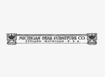
1905 – The logo of the Michigan Star Furniture Company was a standalone banner logo similar to other logos of that genre.
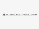
1923 – D.J. De Pree buys the company and names it after his Father-in-law, Herman Miller. While the logo is updated it maintains the strong linear quality of it’s 1905 predecessor.
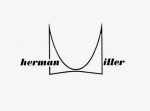
1946 – Irving Harper, working for George Nelson, redesigns the logo and creates the iconic “M”, which was featured prominently in advertising at the time.
1960 – John Massey, in keeping with the times, sets Herman Miller in Helvetica—all lowercase—and locks it to the “M”, creating a logo design that lasted for almost 40 years.
1999 – Months of exploration resulted in an updated Typeface, Meta, and the placement of the “M” in a circle, which continued to be locked with “HermanMiller”—now one word.
2011 – HermanMiller now removed from the logo mark which now represents the entire Herman Miller brand as seen on their website.